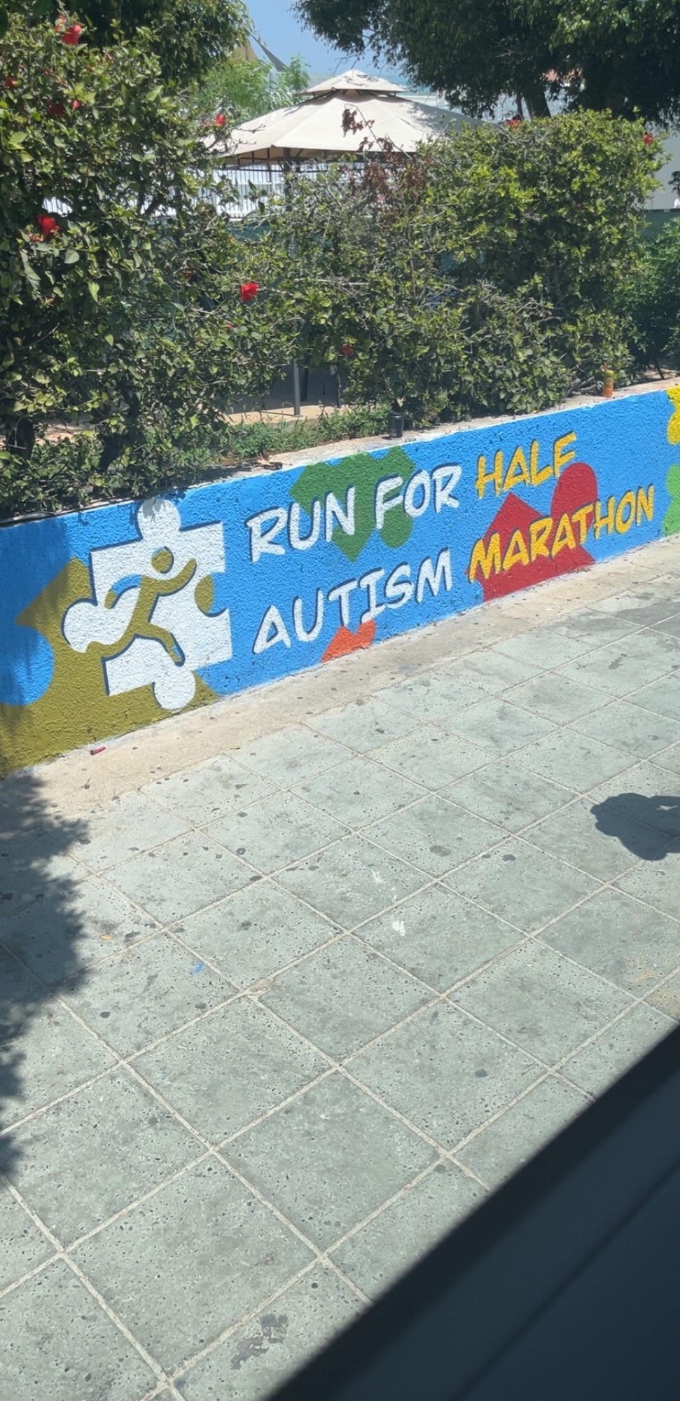
This isn’t a great photoshop job but it illustrates the most frustrating thing about this design: you can easily make it line up far better by writing it normally
Hah, thanks. I figured it was good enough and it just wasn’t worth taking more time for something like this. If I were to improve it more I’d stretch out the “half” a little more, shrink the “marathon” a little more, reduce the brightness and saturation on “marat” a touch, anr then go through softening the edges of each area that copy/pasted. Maybe try to get a little texture back into the red background shape too, not sure how I lost that
This isn’t a great photoshop job but it illustrates the most frustrating thing about this design: you can easily make it line up far better by writing it normally
Idk this photo looks really believable, and only the HALF logo gives it away from me.
Hah, thanks. I figured it was good enough and it just wasn’t worth taking more time for something like this. If I were to improve it more I’d stretch out the “half” a little more, shrink the “marathon” a little more, reduce the brightness and saturation on “marat” a touch, anr then go through softening the edges of each area that copy/pasted. Maybe try to get a little texture back into the red background shape too, not sure how I lost that