

like if you wanted to mix paint to get a color from a computer would you do the opposite of what the RGB value is? I’m confused
like if I wanted to take the RBG code R:99, G: 66, B, 33 wouldn’t it look more lightful than if I mixed paint into 1 part blue, 2 part green, 3 part red? how would you paint a color code?
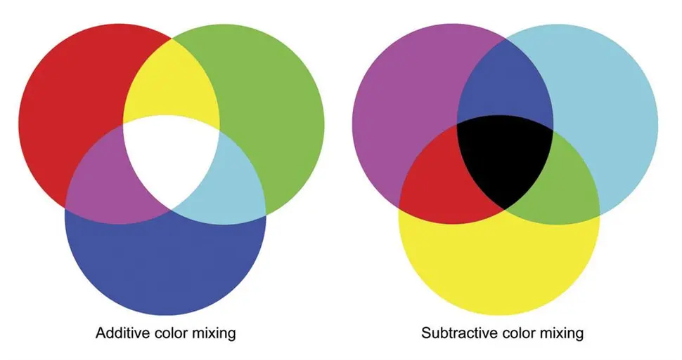
RGB is additive color, best for light emitting displays such as your phone or computer screen.
CMY(K) is subtractive color, the opposite/negative of RGB.
CMYK (Cyan, Magenta, Yellow, blacK) are used as standard printing colors, because they don’t emit light, they reflect whatever light that they don’t absorb.
CMYK = Cyan, Magenta, Yellow, and Key. Key is almost always black in the print world because printing 100% CMY comes out as a muddy almost black. Having Key as black also allows for better greyscale and higher definition over CMY alone.
I mean, you’re almost there, but then you lost the plot. I’m a professional lighting technician, and also happen to have a little bit of experience with paint.
Light is additive color, and RGB is commonly used because your eyes have three different cones that detect colors. You have a red cone, a green cone, and a blue cone. So lights will tend to use the RGB color space because it allows the light to directly stimulate those three cones. If I shine RGB light at a white object, it will combine to reflect as white (meaning the object appears to be white) because the full spectrum is being reflected off of the object.
But the actual colors used don’t really matter, as long as they add up to the full spectrum of light. I could use CMY light instead, and achieve the same basic effect. Again, if the full spectrum is hitting the object, the full spectrum has the potential to be reflected. And that potential is additive color… We add color to the system to achieve the color we want.
Pigment (or really anything that absorbs/blocks light) is subtractive color. CMY(K) is commonly used in printing, but you could just as easily use RGB pigments instead. All that matters is that they’re selectively absorbing light, instead of reflecting it. If a pigment selectively reflects cyan light, (and absorbs all other wavelengths), it will appear as cyan when you hit it with white light. That absorption/blocking is subtractive color. We start with the full spectrum, and remove wavelengths to achieve the desired color.
But the absorption isn’t actually what matters. What matters is that the light is selectively being reflected off of the object. Let’s say I have a pane of glass, which is coated with a special reflective material. This material will allow cyan light to pass through, while all other light gets reflected off.
Now two things will happen if I shine white light at this glass: First, the glass itself will appear to shine red. That’s because when you selectively remove cyan light from the spectrum, it tints red. Since the cyan light is passing through the glass (instead of being reflected) we are effectively subtracting it from the glass’ reflection. So the glass appears red due to the subtractive color.
Second, the light on the other side of the glass will appear to be cyan. Because the cyan light is selectively allowed to pass through that filter. This cyan light could be used for additive color mixing, and could be combined with beams of other spectrums (like magenta and yellow) to form white light.
Now with this above system, we have the potential for both additive and subtractive color mixing, purely due to the properties of how the light interacts with the reflective material. Again, the specific color space isn’t what determines additive or subtractive, it is how the light is interacting in the system. And nearly every natural system will be using both. You’ll have additive color illuminating the room you’re in, then subtractive color selectively absorbing wavelengths to make different objects appear different colors.
Pigment (or really anything that absorbs/blocks light) is subtractive color. CMY(K) is commonly used in printing, but you could just as easily use RGB pigments instead.
There’s a reason CMYK is used for printing. How are you going to mix RGB pigments to get yellow? R+G won’t work. That’s because red ink filters out green and blue light, and green ink filters out red and blue light. So mixing the two you get something that filters out a bit of everything but especially blue, ie. brown. CMY are used for subtractive color mixing because each one filters out just one of the colors we see (C filters out R, M filters out G, Y filters out B) so you can mix them to get most of the gamut you need.
Sure, for printing. But printing isn’t the only form of subtractive color. Plenty of natural pigments exist. Those can be quantified with CMY or RGB values and then reproduced elsewhere, even though the natural pigment itself isn’t directly targeting those three wavelengths. My point is that subtractive color exists everywhere, using all sorts of natural color filtering mechanisms, and CMY is simply what printing uses.
Hell, the blue morpho butterfly doesn’t even use pigment to turn blue. Its wings have tiny microscopic scales that trap light, and blue is the only wavelength short enough to get scattered by the rods and be reflected. It’s still subtractive color, but it isn’t using pigments at all.
Also blue jays
This was a fantastic ELI5. Thank you for your effort in writing this up.
K stands for key. Not black. Depending on the color of the stock the ink uses for the key could be white(on black stock.)
Fair point for non-white stock, gotcha.
Removed by mod
Thank you for reminding me, that for some reason the industry decided to call the darkest color the Key color, my bad.
What is the Key color again? Oh, blacK?
Misinformation and confidently incorrect.
Print is always subtractive. Why don’t you look shit up before posting bullshit?
… because they don’t emit light
As opposed to the posters and paintings that shine, huh?
As opposed to the posters and paintings that shine, huh?
Wtf are you on about? Those are all like print in that they mix pigments that absorb light. That’s exactly what over_clox said. The contrast is with monitors or displays that emit light, like phones or computer screens.
They’re all subtractive in print.
The person said RGB is additive. Where in print is RGB additive?
You don’t use rgb in print.
Oh really?
Would you be so kind to point me to the position in the article that explains how they use rgb? Because the images I came across there seemed to indicate otherwise.
Educate yourself https://en.wikipedia.org/wiki/RGB_color_model
Right back atcha bro en.wikipedia.org/wiki/Screen_printing
Can we all just chill out and have a good [insert time of day]?
From that article:
Graphic screen-printing is widely used today to create mass- or large-batch produced graphics, such as posters or display stands. Full colour prints can be created by printing in CMYK (cyan, magenta, yellow and black).
It’s still subtractive.
Exactly. Print is always subtractive.
Very interesting. Doesn’t use an RGB color model though.
Yes, I said CMYK print is subtractive, did you read my comment?
You’re close to getting it. You said RGB is additive. Where in print is RGB additive?
Hey dude, is everything okay? It’s just the Internet and just a discussion about printing and colours.
Yeah, thanks for asking. You’re okay with misinformation :)?
Oh you’re a fun troll!
Well my password is hunter2
Amazing, I have the same combination on my luggage…
Quick crash course, we’re gonna ignore K for simplicity, and assume a basic RGB system. Okay, simplest conversion to CMY is…
C=1-R
M=1-G
Y=1-B
I’m totally skipping over a lot of stuff here, but this is about the simplest conversion for example sake.
Basically yes, look up additive vs subtractive colors… that’s why for a monitor you need RGB, but ink cartrages are Cyan Magenta and Yellow
https://cdn.mos.cms.futurecdn.net/6FSgP38XcxfqQuiYicQx5Z-970-75.jpg.webp
In short, colored light, and pigments work in opposite ways. Basically all visible light mixes together to make white light. Blue paint, basically absorbs the red and green light, allowing only the blue to bounce back… so mixing more colors of paint, means less light. until almost nothing gets out (hence black). But on a light source, more colors = more light, leading towards white.
A piece of paper is white at first. After you’ve drawn colors on it, you’ve made it closer to black. If you draw in many different colors, it will eventually be black.
A screen is black (emits no light) at first. After you’ve made it emit light, you’ve made it closer to white. If you make it emit all colors at the same time, it is white.
It is the difference between additive mixing and subtractive mixing. When you mix colors on a screen with RGB, you add light. When you mix pigments on a physical medium, you subtract the amount of light reflected (because each paint absorbs most light except the colors it reflects, which are what you see).
As a side note, when mixing in the subtractive color system, your primary colors are cyan, magenta, and yellow. That’s why a printer takes CMYK, for cyan, magenta, yellow, and black. In case you were wondering, ‘K’ here is black.
K is key. It’s not necessarily black ink, but tends to be when printing on white stock.
If you’re printing on black stock, for instance, you’ll likely have white ink for the key.
Thank you for the correction.
Great explanation. Thank you.
Can you also tell me how a computer monitor makes Yellow when it only has RGB pixels?
Sure! On a spectrum of visible light, yellow has a wavelength between red and green. Therefore, combining red and green, the average wavelength is the same as the wavelength of yellow. In fact, a yellow pixel is really just a pair of red and green pixels on most monitors (except with certain types of expensive monitors in which each pixel has red, green, and blue instead of red, green, or blue).
For reference:

I hope this helps.
That makes sense. Thank you. I think the rules between additive and subtractive mixed together in my head and confused me.
I’ve been wondering - how do you make brown? Don’t really see it on the spectrum.
Dark orange, it’s only brown when contrasted with something brighter.
There is a technology connection video that goes into more details.About 2 parts red to one part green.
One curious thing if you understand this is to think on purple. Purple is blue+red, but like you pointed out 2 colors should give you the average wavelength, which in the case of blue+,red should be green. So why the hell do we see purple as something different? Well, that’s because humans have 3 sensors for colors, roughly corresponding to Red, Green and Blue, triggering both Blue and Red without triggering green at the same time gets interpreted differently than green, even though it shouldn’t. Which means that purple is not a color, but rather a mind trick your brain plays on you.
Yes, but violet light does exist in nature as higher frequency light than blue light. Violet is only a mental oddity when mixing additive primaries.
red light + green light = yellow light
Colours are wavelengths of light.
Shining light directly combines wavelengths. It is additive.
Colored paint absorbs the wavelength and reflect only part of it. It is subtractive.
paint and light are different. for light, you are adding colours onto black to make it brighter; for paint, you are subtracting colours from white to make it darker. thus, respectively, additive and subtractive colours.
red, yellow, and blue being “primary colours” is there because people probably think “magenta” and “cyan” are too complex of concepts to teach young kids. it is cool to have a way to make orange and purple without delving into paint ratios, though. it’s good enough for general use for sure, but if you want to get into colour accuracy for print, CMY is the way to go.
here’s a quick and simple cheat sheet to help you out!
additive colours (RGB; screen pixels, LEDs):
- nothing = black
- red + green = yellow
- green + blue = cyan
- blue + red = magenta
- red + green + blue = white
subtractive colours (CMY(K); paint, prints, colouring pencils):
- nothing = white
- cyan + magenta = blue
- magenta + yellow = red
- yellow + cyan = green
- cyan + magenta + yellow = black
When you mix paint, you mix pigments that each absorb certain colors, so they won’t reflect it. You’re subtracting colors to the ambient white light that reflects a smaller and smaller portion of the spectrum on the painted surface, and if you mix enough colors you substract most of it and get a dark brown or even black. When you encode rgb values for a screen, you tell pixels to add colors to the light your screen is generating, and if you add enough you get a white light.
RGB are the base colors for addative methods like light mixing. Think about pixels on a screen.
CMY are the base colors for subtractive methods like paint mixing. Think about printer ink.
I think the simplest way to explain it is:
- colours in a computer work by adding light. Add enough light wavelengths makes white.
- colours in paint work by taking colours out of the light it is reflecting. Take enough light wavelengths out and you get black
Subtractive colors like paint create color by selectively removing some colors from existing light.
Additive colors like backlit or light-emitting displays create color by creating colors of light in various proportions that are then combined.
If you are in a dark room, all paint is black. Until you turn on something with RGB, because then you have some light for it to selectively absorb. However if your RGB is only displaying green light, and you shine it on red paint, it will look exactly the same as black paint (within a certain ballpark of imperfect materials, anyway). Green paint will look green, or white, depending on how your eye adapts, and green and white will be indistinguishable.
That’s the difference between the two color models. Does it rely on other light sources (subtractive), or is it a light source (additive)?
How the brain actually perceives color is really, really wild, so this is all a bit… fluid when you start getting into the weird edge cases, but the general principles of additive=light emitting and subtractive=light absorbing are generally applicable.
CMYK (Cyan, Magenta, Yellow, Key) is for pigments. RGB is for light.
Factoids.
Thanks for asking this. I’ve always known light and paint worked on different color systems, but I never really understood the why behind it. Great answers!
As someone who’s mostly been in the digital domain since childhood and had to learn early on about the difference, it’s one color system, it’s just that they’re doing different jobs.
Other comments are discussing additive vs subtractive colors, but that’s not accurate if you’re talking about mixing paints. Subtractive printing (CMYK) works by overprinting transparent inks, where each ink removes a different part of the spectrum. But mixed paints differ in two critical ways:
- Paints are opaque, not transparent. Unlike subtractive inks, paint doesn’t invariably darken the color it’s painted over—instead it completely or partially replaces the underlying color.
- Subtractive inks are applied to the substrate one at a time—they’re not pre-mixed and applied in one pass. If you mix paints before appying them, you get more of an averaging than subtraction or addition (so mixing primary colors gets you a medium brownish-gray instead of black or white).
A good way to get experience with the subtractive system would be to use watercolors, markers, or dip pens with ink, since those are transparent.
You are right that paint is kind of its own thing and doesn’t really fit into the RGB or CMYK systems
But I would say it’s overall still subtractive. The paint and whatever you’re painting on isn’t giving off any light on its own, its just reflecting whatever ambient light there is (which is usually more or less white) and subtracting from that.
You could maybe argue that it’s more replacive (is that a word?) than additive or subtractive. It just kind of is what it is. It’s just replacing the substrate’s reflectivity with its own since it’s opaque like you said.
And when you mix paints it tends more towards that grey-brown because like you said it’s not layered, it’s more that each pigment is right there on the surface next to each other reflecting and absorbing their part of white light.
So if you mixed cyan and magenta paints together, instead of light passing through layers of cyan and magenta until all the red and green are filtered out so that only blue light reaches the white paper and is bounced back to your eye, you’d have cyan piments reflecting blue and green, mixed in right next to magenta pigments reflecting red and blue. So both are reflecting blue and the resulting color will probably look blue-ish, but the cyan is reflecting some green, and the magenta some red, so that pulls the color more towards grey (somewhere between white and black, even if you mix all 3 it cant really get down to true black or true white because some light is always going to be absorbed and some reflected)
I’m not sure I’m accurately visualizing exactly what you’re describing, but I know from experience working with a two-color offset press that the results are quite different if you print two colors in two passes vs one pass (in which the inks are combined on a “blanket” where they effectively mix together before being transferred to the paper all at once).
In the first case, the result is exactly what you’d expect from a subtractive color model; but in the latter case, the mixed ink that ends up on the paper is no darker than the component inks. The hue is similar whether overprinted or mixed, but the saturation is reduced in the mixed example.
Yeah that’s basically what I’m describing.
I think you just have more of a precise, technical way of describing it probably because you’ve actually professionally worked with color and received some formal training
Whereas I’m a guy with some self-taught Photoshop skills who paints minis, so my color theory is a little rough and ready.
The colors on a monitor are defined by what wavelength they emit. The colors of paints are defined by what wavelength they fail to absorb. When you mix colors on a monitor, you add more wavelengths that are emitted. When you mix paints, you add more wavelengths hat are absorbed, meaning fewer are reflected for you to see.
Have you played hexcodle


